GRAPHIC DESIGN
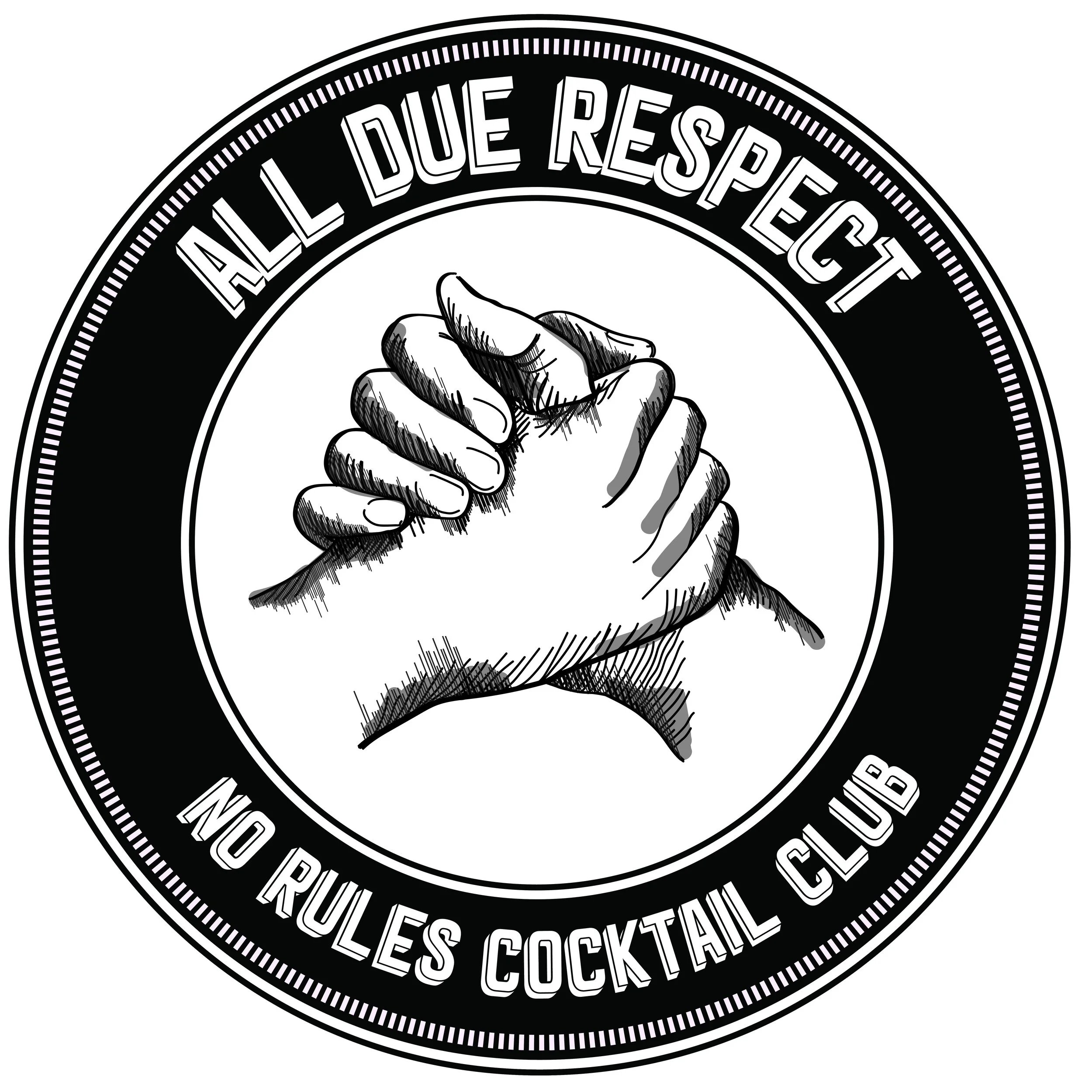
LOGO DESIGN: ALL DUE RESPECT
All Due Respect is a pop-up bar concept providing an upbeat and casual environment for both locals who enjoy high quality craft cocktails and adventurous food at neighborhood prices. With that in mind, we collaborated to create a logo which embraced their mission statement, “paying respect to those who came before us.” A “hand-shake” symbol became the central focus as this embraced people of all different backgrounds who come together and united as a whole within the local community.
Brand Development | Adobe Creative Suite | Wacom Stylus
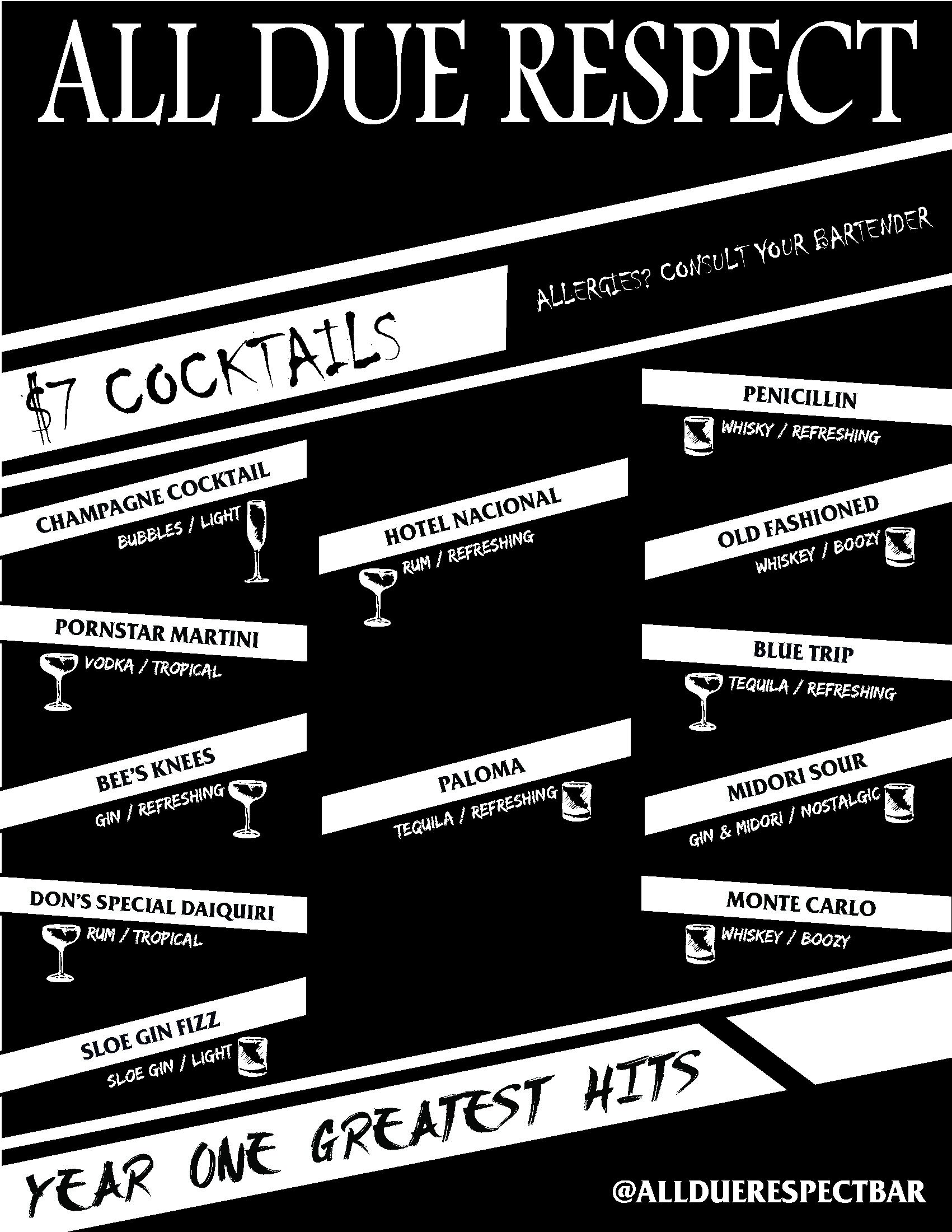
MENU CONCEPT 1: ALL DUE RESPECT
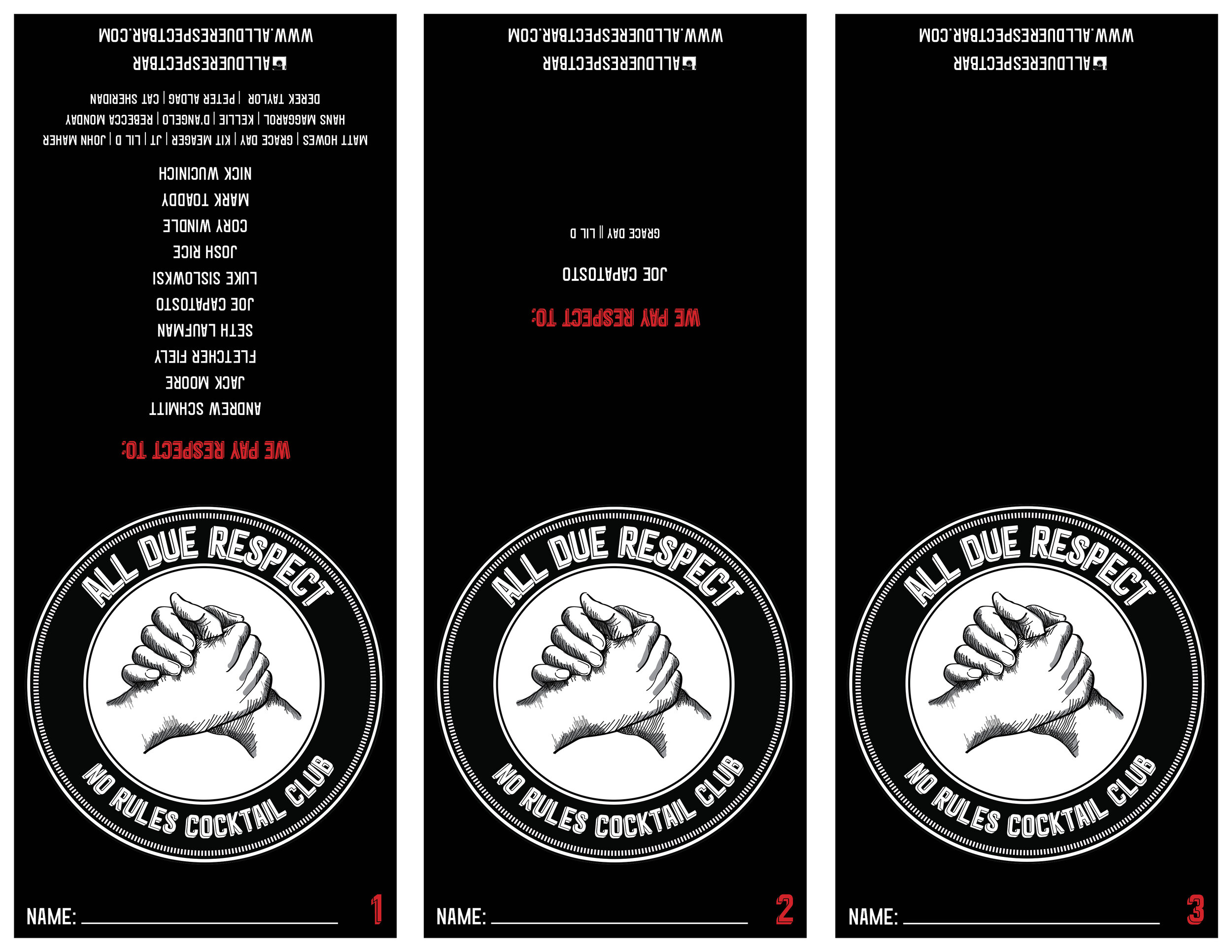
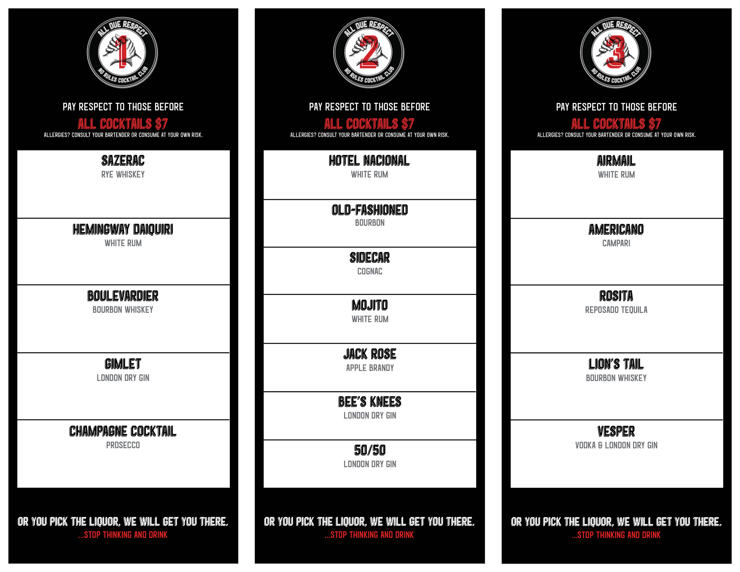
The first menu concept strived to launch and introduce the "All Due Respect” brand to the customer for it’s first three pop-up bar events. The goal was to keep a simple menu which was clear and to the point for the customer. After a cocktail was purchased, the bartender would mark off that cocktail as “complete.” The goal was to create an interactive menu that encouraged the customer to try all cocktails listed on the first menu and once completed, move on to the next. For the following event, as cocktail menus were completed, the names of the customers would be featured on the back of the menu, thus “paying respect to those who came before us.”
Graphic Design | Adobe Creative Suite
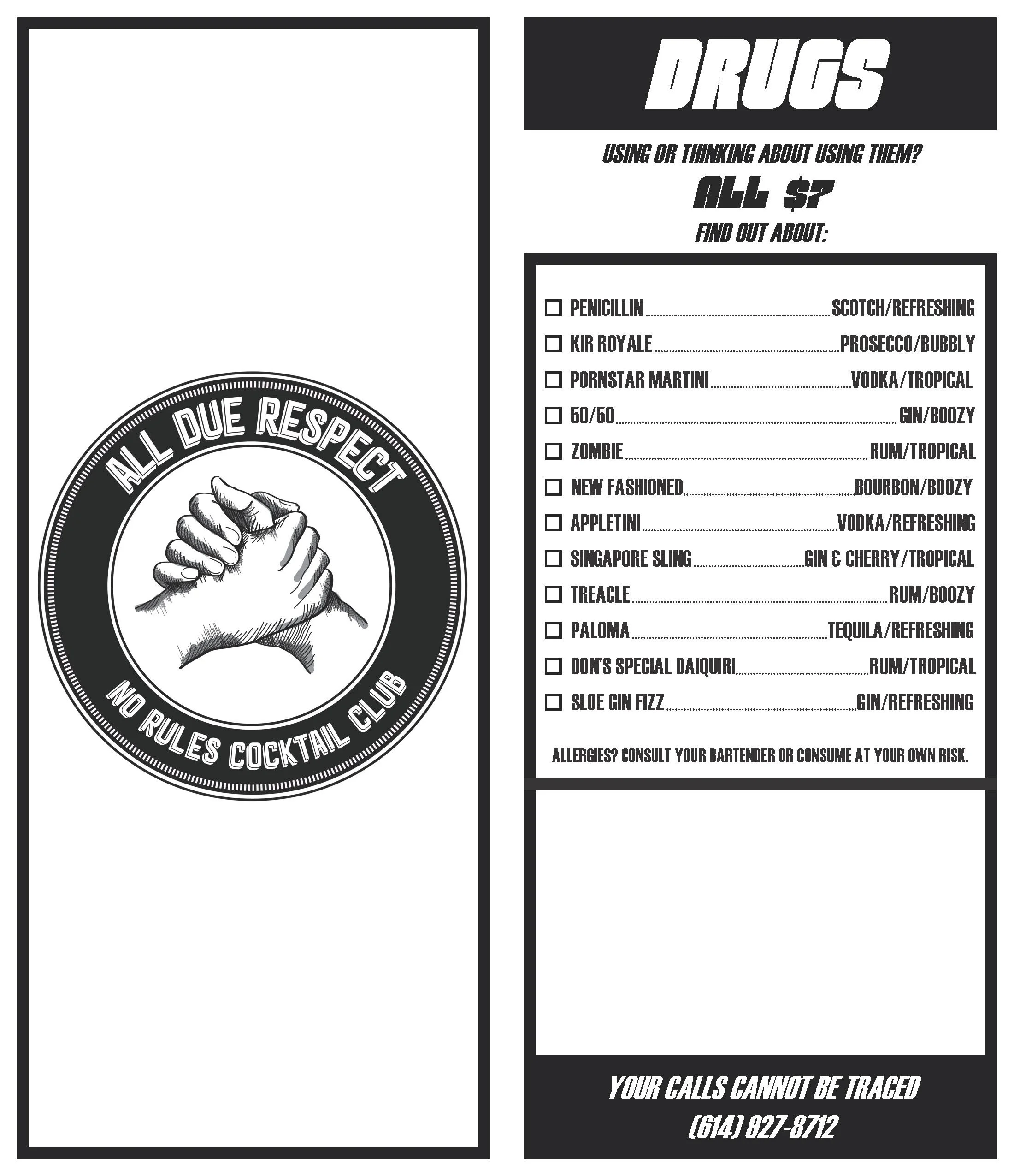
MENU CONCEPT 2: ALL DUE RESPECT / “DRUGS”
The second menu concept was a themed menu inspired by an 80’s “Drug Addition” advertisement. Similar to the first menu, after each cocktail was purchased, the bartender would check off the cocktail as “complete.” Once the first menu was finished, the second part of the menu was printed on a sticker that was attached onto the blank portion of the back side. The menus created a “surprise” factor and encouraged patrons to discover additional parts of the menu that might not be as noticeable at first use.
Graphic Design | Adobe Creative Suite
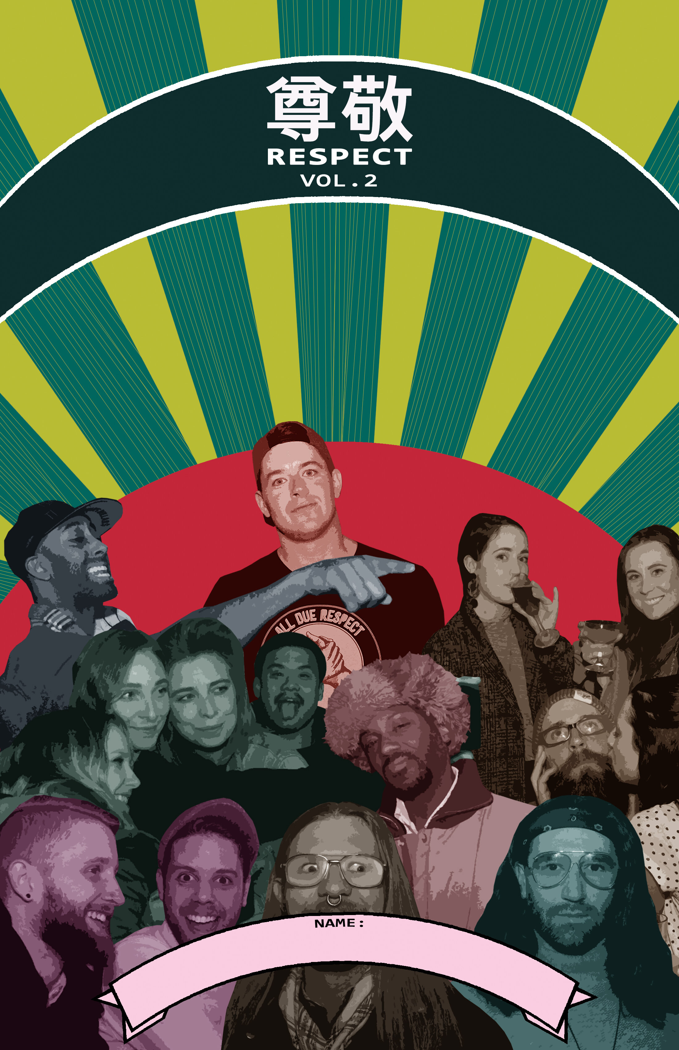
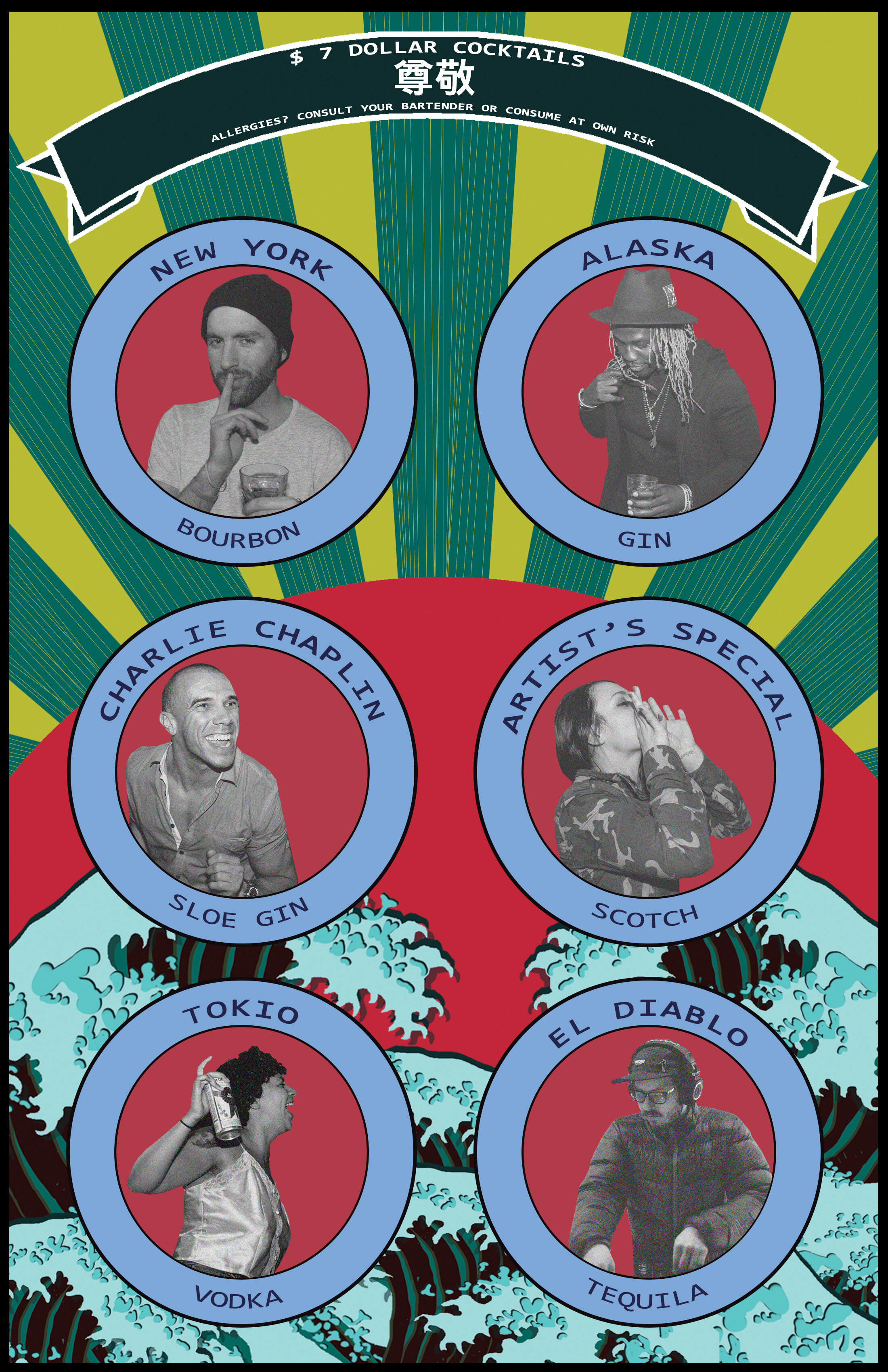
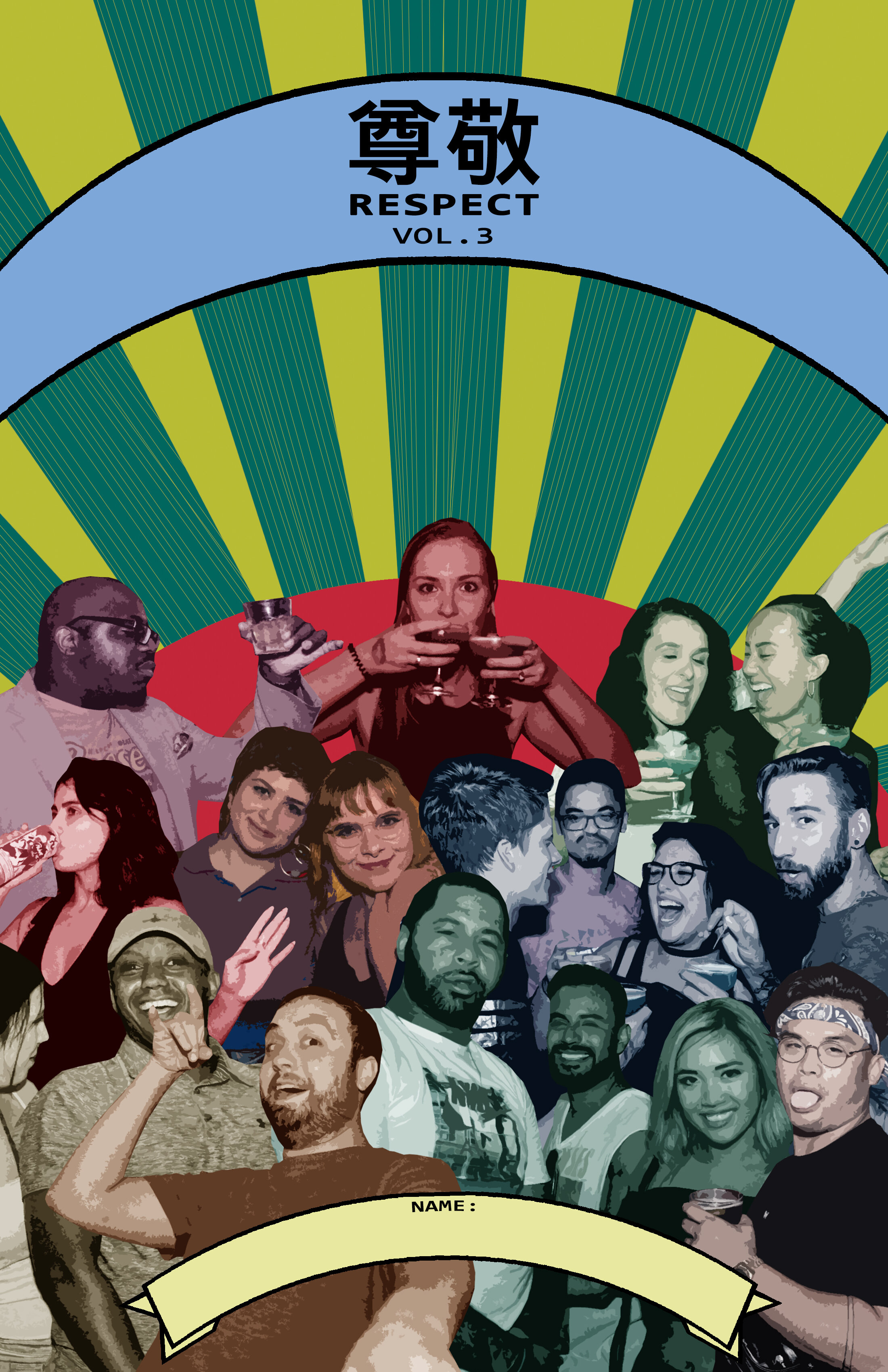
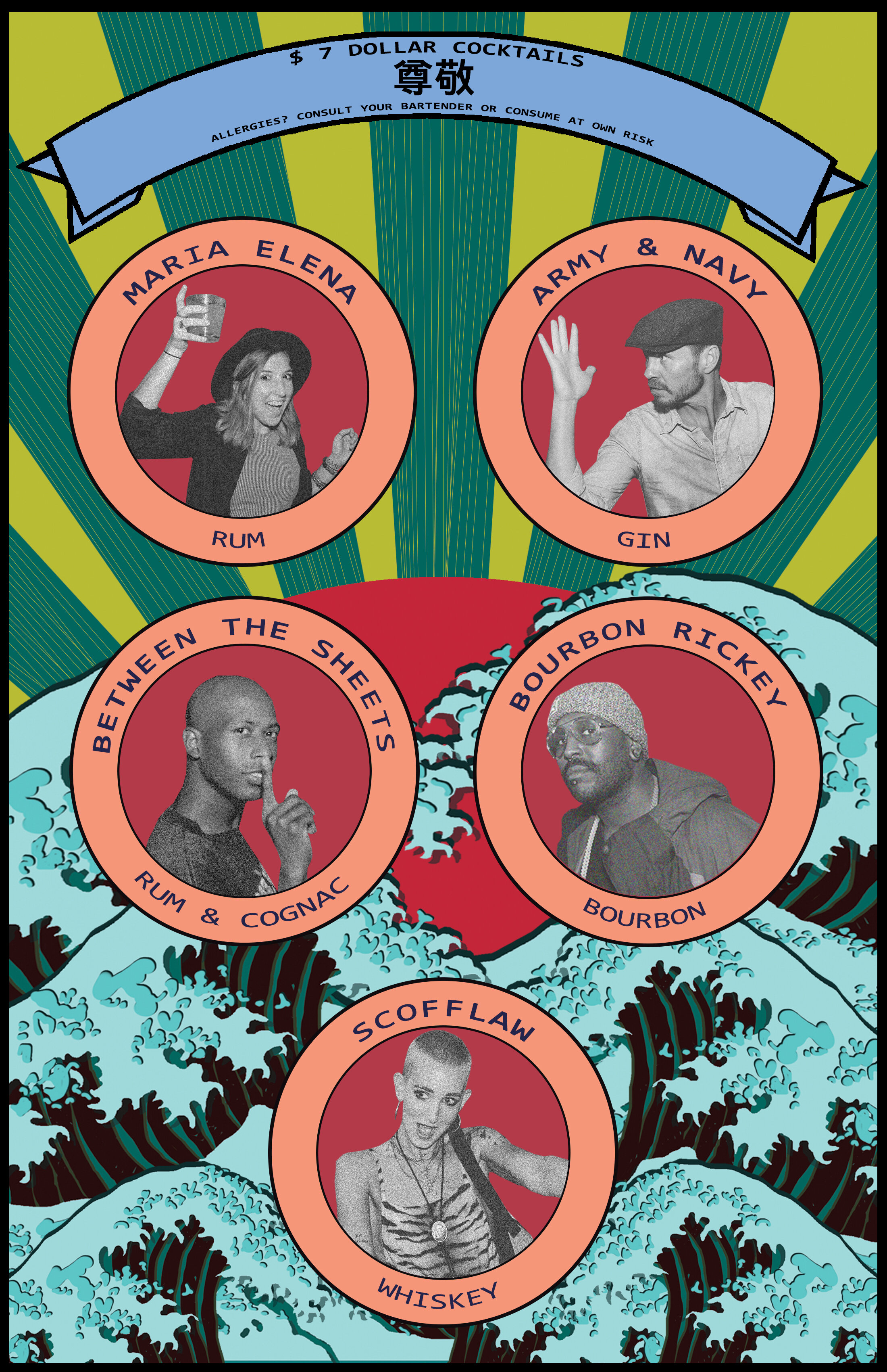
MENU CONCEPT 3: ALL DUE RESPECT / “JAPANESE NEW WAVE”
The third menu concept design “Japanese New Wave” was a themed menu inspired by 70s’ Japanese advertisements. All Due Respect wanted a menu that was colorful and inviting. The intent was to use inspiration from these advertisements and incorporate photos of patrons who attended the events. Featuring customers, thus further embraced the local community and “paying respect to those who came before us.” The customer’s feedback was positive in that they hadn’t seen a menu that included a community who supported an establishment before and thought this was unique and exciting.
Graphic Design | Adobe Creative Suite
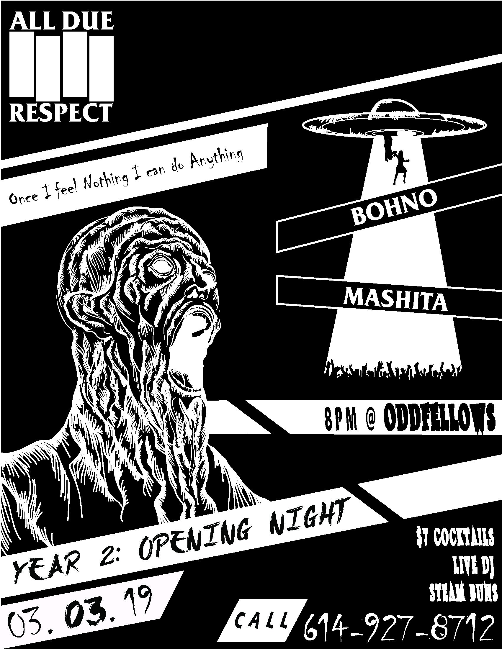
MENU CONCEPT 4: ALL DUE RESPECT / 1 YEAR ANNIVERSARY “BAND MENU”
The fourth menu concept for the 1 Year Anniversary was a themed menu inspired by 90s’ punk band fliers. All Due Respect wanted a menu that reassembled opening night at a concert setting. Menus were double sided and printed on neon paper and stapled to the walls so that customers had to rip them down to order their cocktails. This presentation of menus brought back memories to the customer of their angsty teenage years while attending a punk concert.
Graphic Design | Adobe Creative Suite | Wacom Stylus
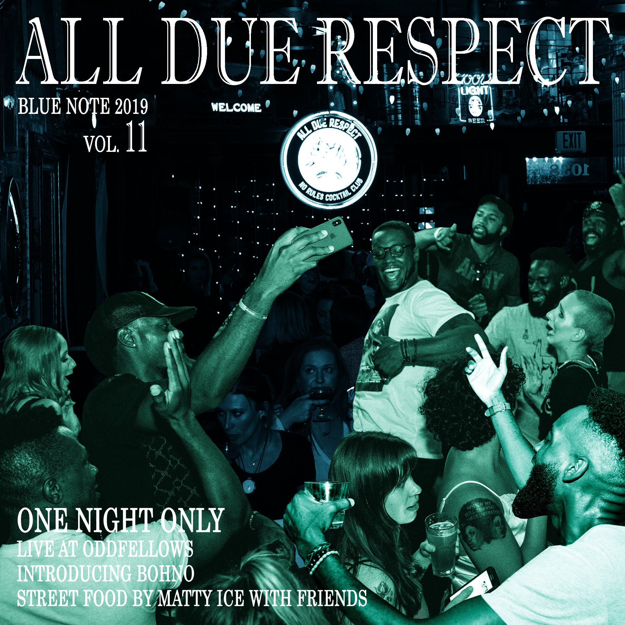
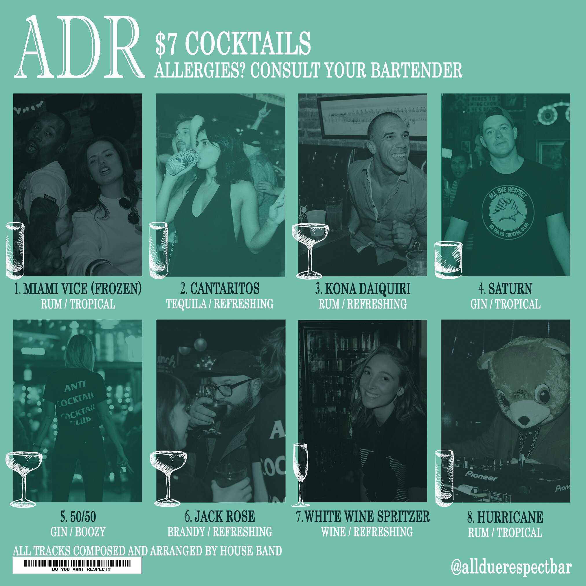
MENU CONCEPT 5: ALL DUE RESPECT / JAZZ “BLUE NOTE”
The fifth menu concept “Blue Note” was inspired by Jazz. All Due Respect wanted a menu that recreated a Jazz album cover. For this menu, customer photos were reintroduced to bring back a sense of community. The rear side of the menu featured drinks and patrons as if they were the tracks of the album. This menu was printed 8”x8” size and inserted within a plastic cover which tied the design and concept together.
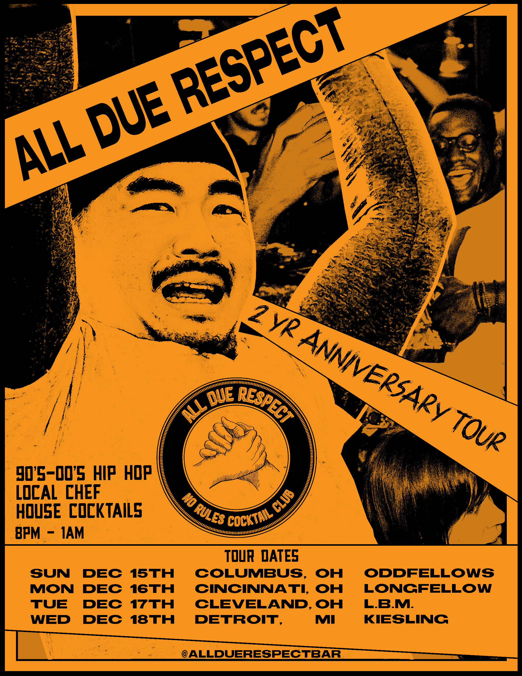
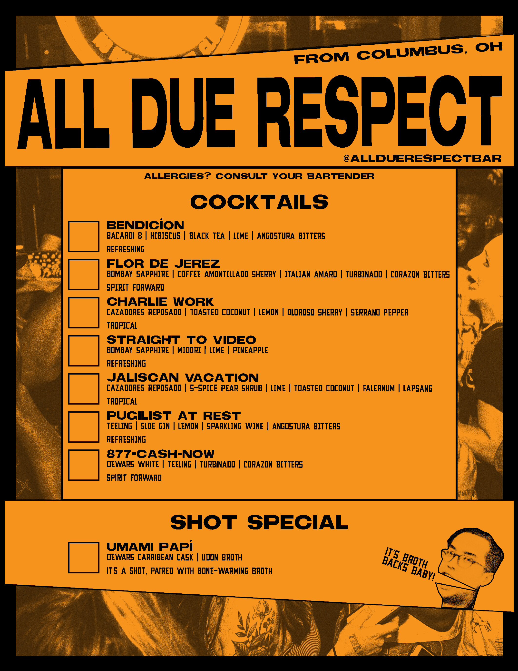
MENU CONCEPT 6: ALL DUE RESPECT / 2 YEAR ANNIVERSARY
The sixth menu design for the 2 Year Anniversary was a themed menu inspired by a rock band going on tour. This was the first time that All Due Respect traveled to areas outside Columbus. To promote All Due Respect, they wanted to create a menu which had a flyer on the front and a menu on the back. This allowed All Due Respect to market themselves, create awareness, and develop excitement for the future events which they would then hold across the Midwest.
Graphic Design | Adobe Creative Suite
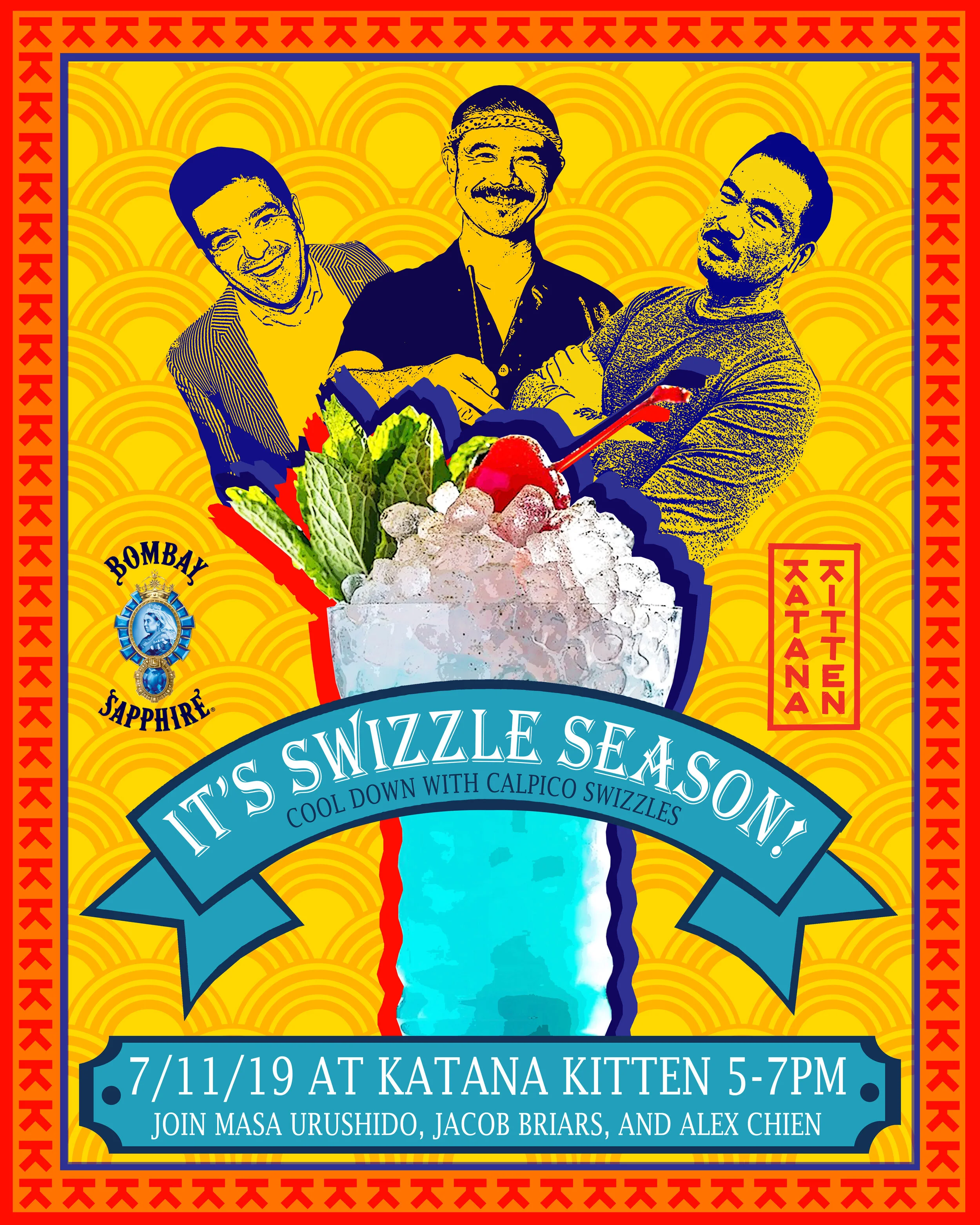
KATANA KITTEN & BOMBAY SAPPHIRE FLYER / CALPICO SWIZZLE COCKTAIL
Katana Kitten, a world-renowned Japanese bar in New York City, collaborated with Bombay Sapphire to host an event which showcased their signature cocktail the Calpico Swizzle. To promote the cocktail, Bombay Sapphire wanted to create a flyer that embraced Katana Kitten’s Calpico Swizzle, Bombay Sapphire Gin, and the sponsors of the event. Inspiration was taken from 90s’ Japanese advertisements as well as the Japanese theme of Katana Kitten.
Graphic Design | Adobe Creative Suite